Important note: To help us resolve your issue as quickly as possible, please ensure to fill out all the sections below. Do not share any private information such as email addresses or phone numbers - This is a public Forum!
Summary:
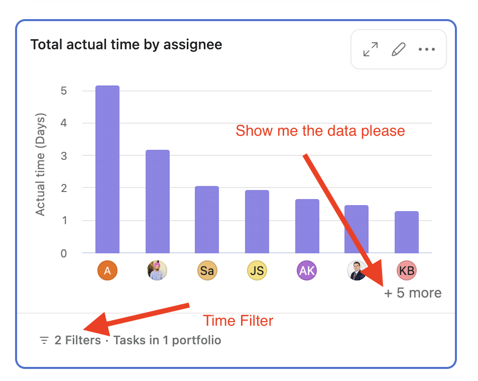
When I add any time parameter to a column chart in reporting, e.g., “Actual Time between 3/01/23 - 3/31/23”, I am no longer able to click the “+ 3 more” grey text to show the data underlying the analytic.
Steps to reproduce:
Add a Column Chart with Actual Time Data
Click the grey “+” button to validate that you can see the data via the Search Query Result Page
Add the Parameter “Time Between” that adjusts the analytic and save
Attempt to click the grey “+”
Cry on your bed.
Browser version:
Edge 112
Chrome 112
What version of Asana are you using (Basic/Premium/Business/Enterprise)?
Business
Hi @Cash_Forshee, welcome to our Community, and sorry for the trouble. I’ve been able to replicate this issue on my end, so I’ve escalated the case to our Developers. As soon as I have any updates I’ll get back to you.
Hi @Cash_Forshee, not yet, but I can see that our Developers are still working on this escalation. I’ll let you know once they share any updates. Sorry for the wait!
Hi @Cash_Forshee, thank you for your patience. I’ve just heard back from our Developers and they’ve confirmed this is an expected behavior, and clickthrough becomes unavailable when a time tracking parameter is used. That said, they’ve noted your feedback and hopefully they can enable this option once improvements are made to the functionality. Apologies for any inconvenience!
Thank you for this update. I’m finding that this is problematic for the viability of time tracking for us, where we need to be able to review the total time entered for a user in a given month.
My primary need is to be able to provide a summary view, where I can see the stories and associated actual times by person. For example
Hi @Cash_Forshee, sorry for the delay; I missed the notification in this post! I completely understand your point. Unfortunately, there isn’t a workaround available to show all the data you need with all the parameters in a single chart due to the limitation in the number of columns we can display.
Testing on my end, I see that expanding the chart shows a few more columns, but I do see that this is not enough for charts with lots of columns. Our developers will be tracking this request for future implementation. For now, I’ll move this thread to our Product Feedback section so other users can upvote it.