Reduce confusion in autocomplete fields

Hi all :wave:

The UX/UI trap that users can fall into
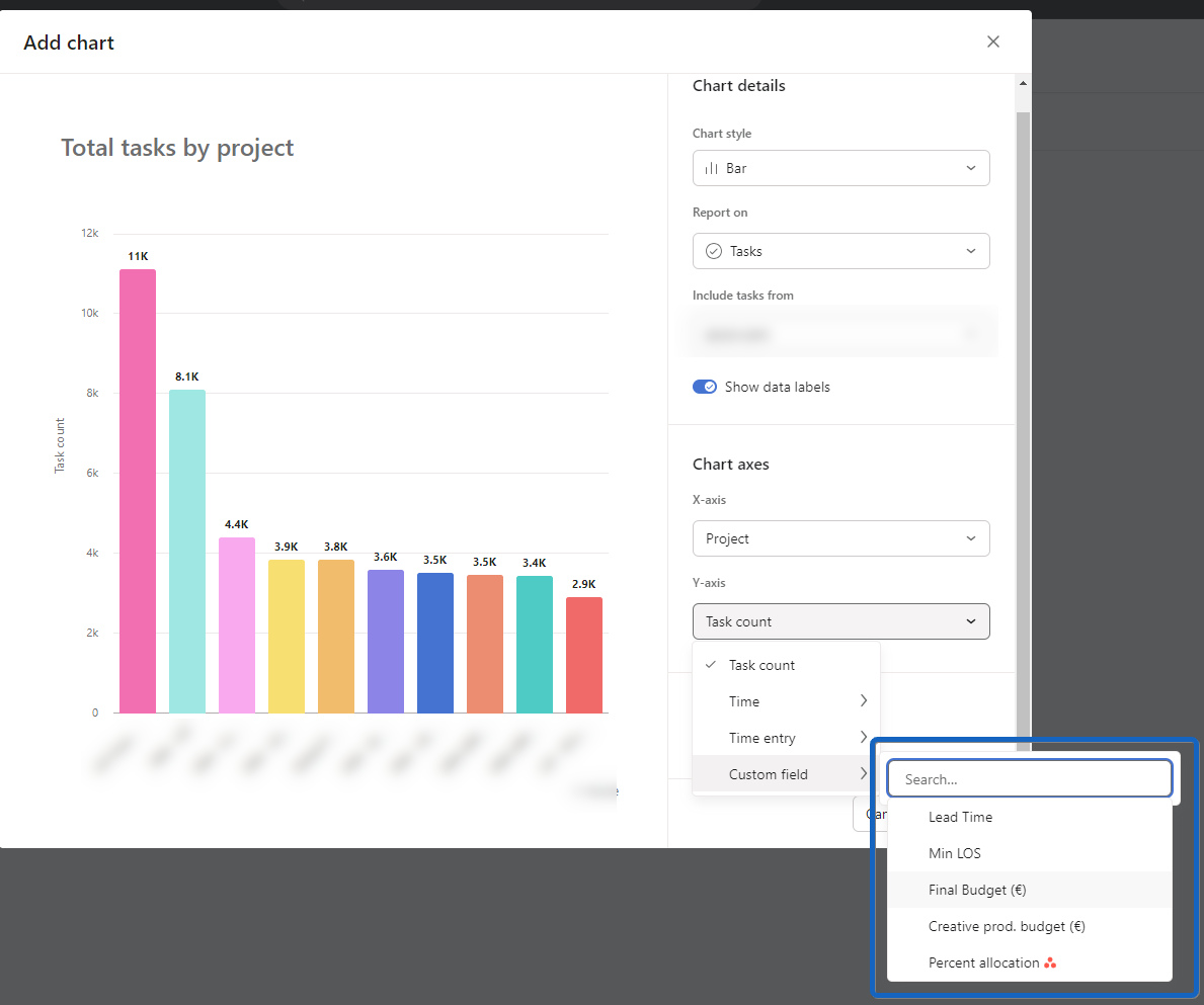
Asana often displays a list of available items in a field (e.g., a list of projects or teams), but sometimes, nothing indicates that the list shown isn’t exhaustive; and it can be misleading for (new) users who don’t think about typing an additional keyword to expand the list.

Sometimes, there is a placeholder with info, sometimes not.

Here are a few examples:

Example #1 - List of teams
chrome-capture-2024-2-7 (1)

Example #2- List of assignees
chrome-capture-2024-4-27 (1)

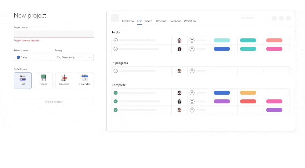
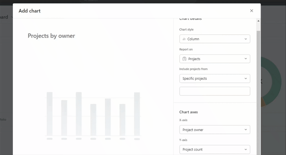
Example #3- List of projects
Charts - available projects

I think the implications are significant. Users may overlook options that are vital to their workflow, leading to frustration and confusion. I’m not ashamed to say it has happened to me by the past :grin:

Possible solutions (I’m not a UX expert)

  • Tooltip of Help Text everywhere there is autocomplete
  • Add an “Expand List” or “Show More” Button

Open to your feedback and ideas :wink:

5 Likes

Thanks for bringing this up, @Arthur_BEGOU.

I agree this UX aspect could be improved. I have also run into situations where I’ve had to explain to clients during training sessions that they can actually type to search for more, within these dropdowns.

I think that the assignee field which currently says ‘Name or email’ when you click into it, could be applied to the other examples shown, and perhaps rephrased to say ‘Type to search for X…’

2 Likes

Yes I agree this would be helpful! I’ve also worked with a client who was confused by this and was convinced she was locked out of her projects and teams :slight_smile: Voted!

2 Likes

Another of those confusing autocomplete cases I met today, with Reports and Custom Fields.
I must not be the only one, and I’m convinced this is an underestimated issue… :upside_down_face:

2 Likes