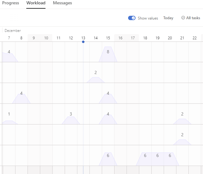
Hi everyone. As much as I love most of the changes and updates Asana is constantly testing and implementing, IMHO this one is very uncool. The new Portfolio Workload grid looks very confusing. It’s now hard to tell the difference between the weekdays and weekends, especially if you have a low-contrast screen. Hope they soon realize this change was unnecessary. Cheers.
1 Like