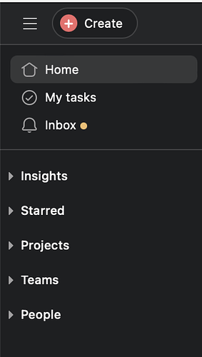
Asana launched the redesigned side bar and I have been using it for a while now, so I thought I would share some of my own use cases.
Before I start, here are some of my pain points with my previous side bar:
![]() The side bar was very cluttered. Too many things, too many dividers, and too many ‘click more’ to see options
The side bar was very cluttered. Too many things, too many dividers, and too many ‘click more’ to see options
![]() I found putting projects under certain teams not to be fully useful if the project is open for everyone in the organisation. I was not sure if I am meant to memorise which team the project was housed under. So I created a team called Org Team where all open projects was housed under.
I found putting projects under certain teams not to be fully useful if the project is open for everyone in the organisation. I was not sure if I am meant to memorise which team the project was housed under. So I created a team called Org Team where all open projects was housed under.
![]() The side bar ended up being always hidden, because I had no use for it in the end. The search bar is so powerful, that I no longer needed it
The side bar ended up being always hidden, because I had no use for it in the end. The search bar is so powerful, that I no longer needed it
None of the above was a hindrance to my productivity, but it made the process of onboarding new members to the platform a bit more complicated - I used to tell them to always hide the side bar and use the favourites and search bar.
With the above in mind, here is what I like about the new side bar:
1 - I can se who is in the team and the projects being worked on.
2 - I like that I can see the forms / templates used in the team as well
3 - I like that I can pin projects in the over view of the team - helps in onboarding new team members or improving a certain process followed by one team
![]() Finally, as asana is integrated with office 365, we do not use team division and messaging in asana. So having the team names a separate section that can be minimised is an added value, so my colleagues can focus on the work at hand and not worry about explanations on why the teams names on asana do not match 100% the teams in office 365.
Finally, as asana is integrated with office 365, we do not use team division and messaging in asana. So having the team names a separate section that can be minimised is an added value, so my colleagues can focus on the work at hand and not worry about explanations on why the teams names on asana do not match 100% the teams in office 365.
Having said all of that, here are few things that could be better:
![]() In the teams view, you get by default active projects. Now even if you do not use archive projects much, you need to know that you can access them by changing the filter. I would like this to be active - archive as different tabs next to each other, just like the inbox functions. Easier to spot and more user friendly.
In the teams view, you get by default active projects. Now even if you do not use archive projects much, you need to know that you can access them by changing the filter. I would like this to be active - archive as different tabs next to each other, just like the inbox functions. Easier to spot and more user friendly.
![]() Completed projects that are not archived are still visible in the list view of projects in the teams tab. Perhaps have completed as a filter visible next to active. So the filter is Active, Completed, Archived
Completed projects that are not archived are still visible in the list view of projects in the teams tab. Perhaps have completed as a filter visible next to active. So the filter is Active, Completed, Archived
![]() I can see members directly, but members with specific access to projects are visible after you click on the three dots. IT would be good to either have this visible, or to have Asana recommends users who are collaborating the most on projects with this team to be added.
I can see members directly, but members with specific access to projects are visible after you click on the three dots. IT would be good to either have this visible, or to have Asana recommends users who are collaborating the most on projects with this team to be added.
![]() I would like to see Goals in the over view tab of teams as well and their relation to the overall company goal. This will make the overview tam a bit more usable I think.
I would like to see Goals in the over view tab of teams as well and their relation to the overall company goal. This will make the overview tam a bit more usable I think.
And finally, if you are still trying to find your way around the new side bar and you have plenty of stuff starred or hidden, not appearing, why not try asana’s 10 days declutter programme. It takes 5 min each day, and helps you get organised maximising the use of the new side bar. Here is the link - especially day 8,9 and 10.
Anyone else like me used to hide the old side bar and now checks in on it more than before?

