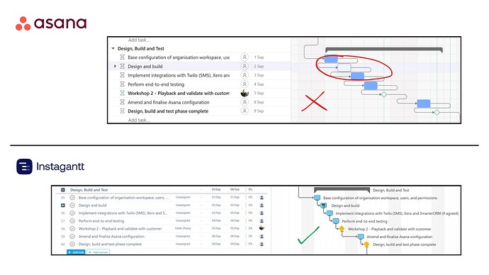
In timeline and gantt views, how dependencies are represented gets really messy when the next task is due in the next one or two days. See my screenshot below. What if the arrow came out of the bottom of the prior task instead the right-side of it. See an existing simple task collection below (top), compared to how clean it could look (bottom). I know there are still edge cases here where it could be less clear, but it seems in most cases it would be a net improvement.

Hi @Shawn_Taylor , I agree and you have my vote!
Btw, you’ve got some pretty good Photoshop skills ![]()
Even in more spread-apart tasks, this is causing a lot of unnecessary visual noise in my Gantt views right now, I’m hoping this is improved soon!
Hi @Thomas_Azoug , this appears to be part of an A/B test which I personally also find visually noisy!
haha thanks! My background is photography, so I used to be in photoshop half of every day ![]()
I completely agree. The spaghetti geometry for dependency arrows is a deal breaker for me. Why fix what’s not broken. Typical Gantt chart allow for an arrow to cross over the body of another task in order to always make a B line for the task it is linked to.
Does anyone really prefer reading a Gantt chart like the one below?
Also, maybe it’s my dark mode that makes the arrow lines hard to read, but I would love bolder arrows too!
+1
We upgraded to a higher tier of Asana to use more of the project planning functionality and now this Gantt chart view is entirely unusable.
We have multiple projects that look like this:
Massive UPVOTE for redesigning and cleaning up dependency lines/arrows.
It really isn’t necessary to have the long and windy dependency lines in a gantt. Keeping it clean and uncluttered is critical for project managers especially when viewing a project with complex dependencies.
I have zero photoshop skills hence showing an example from Instagantt which has significantly cleaner lines. ![]()
Asana, please redesign the UI pretty pretty please? ![]()
Got my vote. The current view is cumbersome at best so anything which makes this easier to interpret has to be a good thing !


