Is there anyway to compare estimated time to actual time reported easily and visually within reporting dashboards? Also, is there a way to do simple utilization comparisons for time on task vs administrative time? These are things our Ops group routinely monitors for biz health but don’t seem easily possible in Asana’s reporting dashboard. It would seem to me that a multiple line graph or more customizable burnup-esque comparison would bring reporting a long way toward being a one-stop-shop for metrics.
This is indeed not available yet, stacked chart or multi line would be cool.
Hi @Bastien_Siebman - any ideas on workarounds or 3rd party tools, please? Struggling with this (much as I hate to admit it!)
Hi @Jon_Cunningham , Screenful looks quite impressive but I haven’t tried it yet. Let me know what you think, if you try it!
Thanks @Richard_Sather! Will take a look!
Having a multiple line graph would be amazing. In my case I’d love to see the different options of a custom field be the Y axis and then weeks as an X axis so we could easily compare the number of items within a specific custom field type week over week
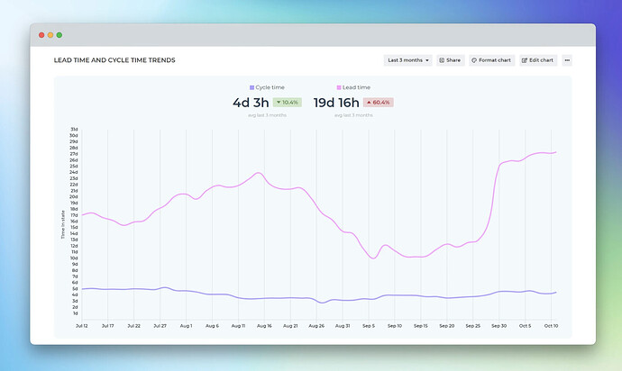
Hi, @anon3801900 @Jon_Cunningham (thanks for the mention @Richard_Sather). Screenful indeed has many of the charts mentioned in the thread, including a multiline chart:
and a Stacked bar chart:
You can have a custom field as a Y or X axis. See the complete list of charts on the Tour page.
Unfortunately, we’re limited to basic Asana so it won’t work for my use case but that looks really nice! Having those available would absolutely improve the reporting functionality for us.
Being able to create dashboard charts and/or reports to compare estimated time vs actual time would be so helpful! I’d also love to be able to easily see tasks where the actual time exceeded the estimated time, and tasks that were completed with no actual time recorded.
Is there maybe a way you could do this by syncing to google sheets and creating charts there?
Hi everyone and thanks for sharing your feedback!
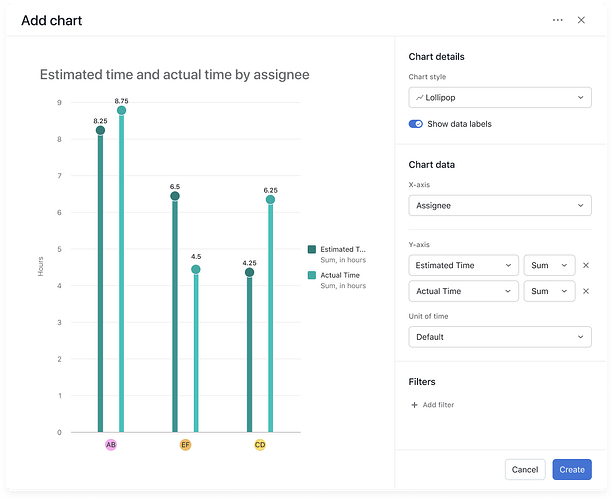
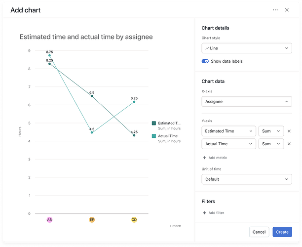
I’m excited to announce we are rolling out the option to add multiple numeric and time metrics to the same chart, allowing you to compare different performance measurements side-by-side.
With Multi-Metric Charts, you can:
- Add up to 4 different metrics on a single chart
- Compare time-based metrics (like Estimated Time vs. Actual Time)
- Overlay different performance indicators to spot trends and correlations
- Get a 360° view of project performance by comparing related metrics side-by-side
This functionality is available in Line charts, Bar charts, and Lollipop charts across Universal Reporting, Portfolio dashboards, and Project dashboards.
Real-world applications:
- Resource planning: If you’re using Time tracking, you can now monitor how team members are performing against their allocated time, helping you improve future planning.
- Budget tracking: Compare changed_amount, estimated_amount, and total_amount of your catalogs to identify spending patterns.
- Performance analysis: Overlay completion rates with time metrics to understand team efficiency.


