Hi Garrett,
Would it be possible to create a toggle for people who need colorblind assist instead? Some of my teammates and I believe that this change makes it more difficult to differentiate colors, especially the greens.
Hi Garrett,
Would it be possible to create a toggle for people who need colorblind assist instead? Some of my teammates and I believe that this change makes it more difficult to differentiate colors, especially the greens.
Agreed, @Zach_McMorrough, it would be nice for this to be a toggle-able feature so that the colors can be toggled on for people needing accessibility support, or normal colors left as is for the rest of us.
I personally use the colors to identify priorities and specific projects, and the old colors worked better as they were more easily identifiable and contrasted. The current colors are harder to differentiate.
Please add a toggle between these modes. Just like Zach_McMorrough’s above comment, it’s now really hard for my team to distinguish between the greens. We’re also finding it difficult to differentiate between the blue/purples. The higher contrast was much better for my accessibility and I kindly ask for it to be returned.
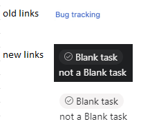
Found another visual change.
I know these changes may be insignificant for most people but for those of us who rely on visual cues this can be a massive deal.

Now trying to find a task link in amongst all other text is quite difficult.
Can we please have a way of seeing the old style links too?
This topic was automatically closed after 19 hours. New replies are no longer allowed.