Is there a way to clearly indicate the colors for stacked bar charts in universal reporting?
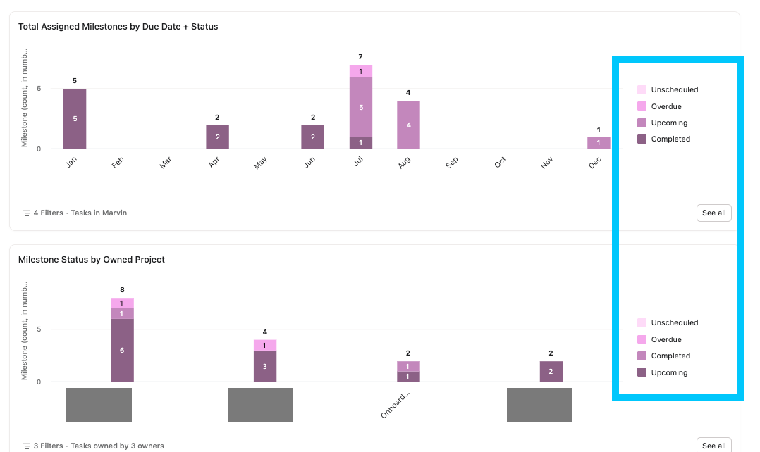
I am currently running into an issue where Asana is auto-assigning the colors to Task Status for stacked bar charts. This is totally fine - except that it isnt consistent which color is used for which status. In some instances the darker color is completed, and in others its not. I am concerned this could cause confusion due to the lack of consistency. Can we get this to always be consistent? Completed is always darkest, etc?
Or is there something I’m missing to trigger this myself? Thanks!
Hello @Anna_Jos - Thank you for your suggestion. I am going to move this post to our English Forum > Product Feedback so users can vote on this by clicking vote next to the title!
Hi @Richard_Sather - I do have that option and it certainly helps differentiate the status types - but the colors are still not consistent. Sometimes Completed is purple and sometimes its green! I am creating reporting dashboards for leadership at our org, and I worry that if colors are not consistent that risk of misreading/reading too quickly is higher and may cause frustration problems!
I appreciate the thought though, and as mentioned i have been enjoying the multi option as it is easier to read!
Hi! Also finding this inconsistency in color when it comes to comparing Estimated and Actual Time in Charts. See the below screenshot to see how Estimated time is sometimes shown in Purple, and others in Green. (And Same with Actual Time) Just wanted to share in addition to the above report.
Wondering if there’s anything that can be done to create consistency? I would hate to have to export data and recreate graphs just because Asana is unable to have consistent color in the native reporting capabilities.
I also ran into this issue. We have two phases of staff training assignments in a single project, and the task statuses have been assigned different colors on identical stacked bar charts in the same dashboard - so “completed” is purple in the first graph, but “upcoming” is purple in the second. The inability to change the color assignments makes the charts nearly impossible to use. Has anyone come across a fix for this?