Launched earlier this year, custom task types are great and I’m finding more and more use cases for them, instead of using a single-select ‘Status’ field.
However, if you are not liking the single letters being displayed as the task icon on the left, there is a simple hack to just have the task icon as a single block of colour. How?
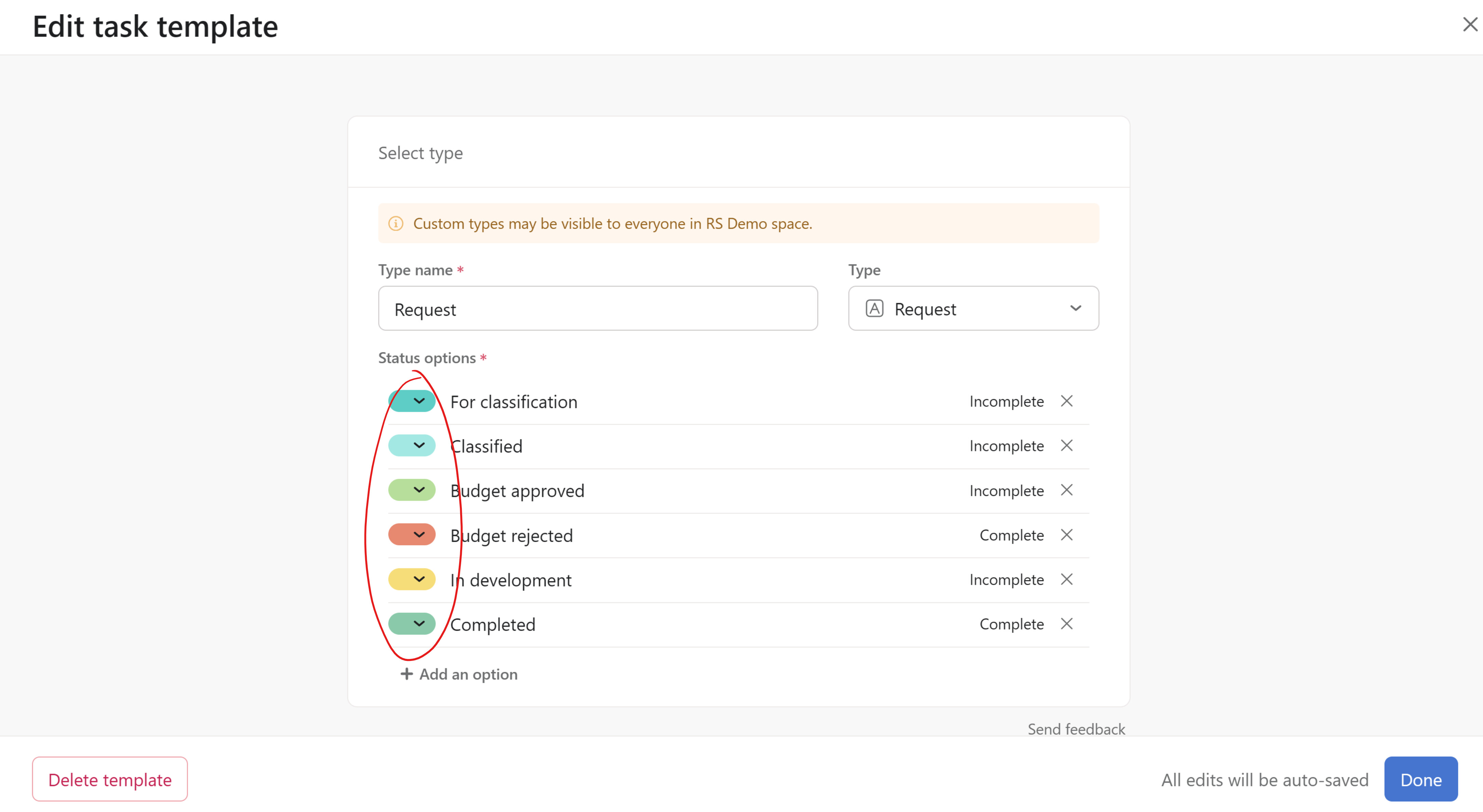
Access your custom type from Customize>Templates and click on your template.
In the editor, just add a space before the first character of each of your status options…

…so you end up with no letters displayed in the task’s icon, like this:
So in your projects, instead of looking like this, with single letters…

…they could instead look like this, with just blocks of colour:

And, if you use emojis, like myself, but if some don’t render nicely in the task icon…

…just add a space before the emoji so they aren’t displayed in the task icon, for a cleaner look:

Enjoy your cleaner task types with just solid colours ![]()
Full credits to my customer, @Ian_Layton-Smith who discovered this hack!