A new way to write clearer, more detailed tasks

Hi Asana Community :wave:

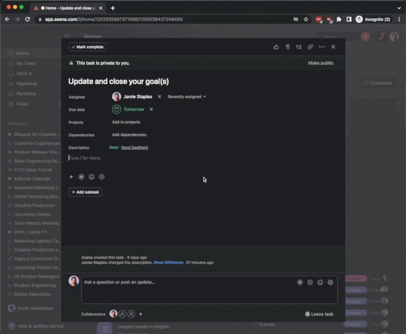
We’re adding a new way to write clearer, more detailed tasks in the task description! This update will allow you to provide additional context to your work—right in Asana.

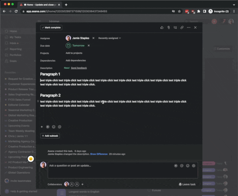
Starting today, you’ll notice a new menu, making it easier to access key actions at your fingertips—record an async video, find the perfect emoji, and apply new formatting options, like headers and section breaks. You can also move things around within the task description with drag and drop.

This has already started rolling out to some Asana domains and will be available to everyone by end of October. In the coming months, we plan to bring even more functionality to the task description— automatically unfurl links from outside tools, like YouTube or Figma, and include images, screenshots, or tables directly in the task description.

If you have any questions, please let us know. We can’t wait to see how you use the new features! :slight_smile:

19 Likes

This update is absolutely horrible. Not only does it not help us to facilitate better communication and work flow, it actually causes more time to have to be spent.

The way everything is now broken up into sections causes issues for the way we paste and copy description information into tasks from other programs.

Further, you can no longer triple click and highlight a line of text, it highlights the entire section.

13 Likes

A description should be just that – a description. No special formatting or anything else. If you want to add another section for notes, below the description. That would be fine. But the description itself should be plain text.

9 Likes

Not a full solution, but when copy/pasting from another program, you can do CMD (Ctrl on Windows) + Shift + V which pastes unformatted. That might help if you don’t like the formatting or have formatting issues.

Just a friendly person chiming in with something, can’t speak to anything else you mentioned :thinking:

6 Likes

Unformatted doesn’t fix anything. It still pasts it in in multiple paragraph groups. The fact that I can’t press enter without it going to a new section, and I can’t triple click to select a line any more is a pain.

2 Likes

Great job guys!

I absolutely love :heart: this and can’t wait for the additional updates to come!

I think this update will also naturally actively encourage people to write better descriptions. A great example of how UX drives (the right) behaviour.

Keep it up! :muscle:

3 Likes

This change is frustrating. Previously, the description would have a border around it when your cursor was focused in the field. Now, there’s no visual indication that you’re in the description field. When the field is long (as many of ours are), it’s incredibly difficult to see what field you’re in. There’s also a lot of white space now between the end of the description and the create new subtask button that is only used when you click into the description and the mini menu buttons are displayed. I keep thinking that there are trailing newlines in the description only to click into it and see nothing. The other major annoyance is everything being hidden under a single plus button. Now I have to scroll down in a popup menu to see options like creating a numbered list and adding a link. There’s already so much scrolling in Asana that trying to scroll just this popup and not my task list or the task itself is difficult and more steps than what the old menu was that showed me everything on one click of the A button.

8 Likes

I love these formatting enhancements! For the longest time I’ve had to manually format headings as bold and enter white space to separate logical sections in the description. Now all I have to do is select “Heading 1” and “Section break” respectively. It’s also great to be able to drag whole paragraphs.

Can’t wait for more improvements.

4 Likes

@Connor_O_Shea Did you try the “Send feedback” link next to the new Description field label? I’m sure that will get better routed.

I did that, as well.

1 Like

Hi Matt, thank you for this feedback.

While we’ve heard positive feedback during our closed beta from customers mentioning this will make it easier to provide context to their work, we understand change takes some getting used to. That said, our Product team is taking all feedback into account to iterate the experience over time.

Have you tried Shift + Enter to have plain text editing?

3 Likes

Hi @Connor_O_Shea, thanks for providing this feedback.

As I mentioned in a previous comment, while we’ve heard positive feedback during our closed beta from customers mentioning this will make it easier to provide context to their work, we understand change takes some getting used to.

You can use the “/” shortcut to bring up the options for numbered lists and hyperlinking to save you scrolling to the + symbol at the bottom of the description.

1 Like

The Shift Enter isn’t the biggest issue. The biggest issue is there is now no easy way to triple click to highlight a line of text. Triple clicking now highlights the entire description field, or the sub section of it.

1 Like

Respectfully,
how is selecting “Heading 1” or “Section Break” easier than just hitting Control B to bold or hitting enter to break into a new section?

Dragging whole paragraphs just results in people accidentally moving part of the description and now it’s like – wait… how did this happen? What does this even mean?

2 Likes

Looking at this comment thread you have a 50/50 split on if this is a good change, or a bad change. I’m not really sure how this got through beta testing.

Perhaps give us an option if we want a plain text editor or an enhanced editor?

3 Likes

The issue with the “/” shortcut is the popup that displays still makes me scroll down to find the options buried at the bottom of the list that were previously buttons that expanded to the horizontal width of the screen and always visible.

8 Likes

Re: selecting “Heading 1” or “Section Break” - I’ll simply type “/h[ENTER]” to get Heading 1 or “/s[ENTER]” for a Section break. What I like about the result is that it truly formats the content as I intended it to be. For instance, simply Bolding text did not convey the fact that I wanted that to be a heading, since I’d like to also Bold other stuff that are not headings.

Re: Dragging whole paragraphs - This is just a question of getting used to the feature. Initially I’ll fumble, but eventually I’ll get to a point I don’t accidentally move text. AND, if at all I move text unintentionally, there’s Ctrl+z to undo it.

I won’t deny that there are quirks about Asana that I really wish would be fixed. Like sometimes SHIFT+TAB indents a bullet point instead of un-indenting. Issues that result in unexpected behaviour. These new features, however, are not bugs and they really do enhance the experience - at least from my perspective.

2 Likes

I agree that the triple-click comes off more like a bug than a feature. It’s standard expectation in text editors that triple-click highlights a line, not a paragraph.

2 Likes

@Matt_Hoppes,

Just for everyone’s clarity let me address a couple of your comments. I am sure it won’t change your preference for plain text but that’s not my goal :slight_smile:

Quickly apply formatting

It is not, but it lets you keep your hands on the keyboard which is a positive; from there you can now trigger other commands too, and I am sure more will come.

It can go faster, I agree with you. Use the below shortcuts:

Shortcut Formatting style
# + space Header 1
## + space Header 2
- - - (triple dash) Section break

2022-09-29 Screenshot 000312

Just to avoid confusion, the usual CTRL + B, CTRL + I etc. work like before; in addition, you have now, when you double-click on a word, a layover that allows users who prefer the mouse to select the formatting option. In either case, no scrolling is required.

2022-09-29 Screenshot 000306

Dragging blocks of texts

This cannot easily happen accidentally. The user has to be very intentional about it.

The dragging action can be activated only on a specific area of the block which is on the very the left side, and it has a size of 5 by 10 pixels; it is animated and catches the eye of the user as he moves the mouse around the area and requires a “left click + hold + drag + release button” action.

2022-09-29 Screenshot 000305

Triple click behaviour

I am confused here, I have to admit that I am not an avid user of the triple click, but I have tried to reproduce now the behaviour you mention in:

  • Old Asana Description
  • New Asana Description
  • A standard plain text editor

The behaviour is always consistently the same, a triple click highlights the entire paragraph, not a single line of text. This is what I expect from a triple click usually.

← Left side = New Description
→ Right side = Old Description
↓ Below = Normal plain text editor

2022-09-30 Screenshot 000325

Are you able to share an example here for my understanding? I might be missing something.

Cheers,
Rosario

12 Likes

How do you get back to the “Old Asana” description to duplicate it?

On the old description don’t edit it, just display it. In just the normal display triple click andd dit will just highlight a single line.

Also, in the old description, it shouldn’t be a paragraph. It should be a line, followed by a return, and then another line.

So:
Martin Smith
234 Smith Street, San Francisco, CA
980-333-4444

In the old Asana triple clicking the address will highlight just the address. In the new it highlights the entire thing.

2 Likes