I was coming to ask the same - It just changed over for me in the last 20 minutes or so, and it looks like the check box now turns green but the font stays black, which is super confusing visually - we definitely want our many completed subtasks grayed out like they usually are! Hoping it’s just a glitch…
I noticed the change in font colour this morning and agree that it’s visually confusing. In a long list of tasks, it’s much harder, at a glance, to work out where you are up to. Would love to see a return to a lighter font colour being used again.
Hi folks How completed subtasks are displayed has indeed been updated.
I’ve gone ahead and updated the title of this post slightly to make it more discoverable for other users. I’ll keep you posted here if our Product team make any more changes!
FWIW, on Chrome Mac latest, I was not seeing the new problem reported above, refreshed, and now I am seeing the problem! Something broke. cc/@Community_Managers
Briefly describe (1-2 sentences) the Bug you’re experiencing:
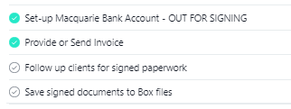
When completing a subtask, the text of that subtask used to appear greyed out when complete. This made it easy to identify which subtasks were still outstanding and which had been completed. This no longer happens and completed subtasks can only be determined by the green tick at the front of the subtask.
This makes it a lot harder to determine where we are up to in a process, which is how we are utilising tasks and subtasks in Asana.
Steps to reproduce:
Browser version:
Firefox 88.0.1 (64-bit)
Google Chrome Version 91.0.4472.77 (Official Build) (64-bit)