Is the new color palette customizable? If so, how?
Like everyone I think the intent is good, but the result not so good. I have projects which were already a bit messy with lot of colored custom fields, but now with the new colors it has become really hard to focus on any field.
4 Likes
Just adding my voice to the previous comments - new design and colours are not convenient. Hard to read, too bright, too big compared to before.
4 Likes
Please bring back the old color palette or add an option to change it. Colors are too bold and it’s tiring when you have a lot of tags and work with asana for hours!
3 Likes
I would also like the option to return to the previous colour palette. I spent a lot of time every day on Asana and the new colours are too bold making it hard to read and very hard on the eyes even only after a few hours of having this update. Our board have multiple custom fields with multiple different colours to denote status and the new colour scheme has made this very hard to view.

6 Likes
My team definitely noticed the change - hard to say if they like it, we will manage but it will take time to get used to. I personally find it much easier to view with the “color blind friendly mode” on - in the Profile Display settings - colors are less bright and easier to focus, but the change is not that significant.
6 Likes
I’m also going to weigh in that we’d like to be able to revert to the old color palette or be able to easily customize our own. We had picked colors very specifically to help visually handle things like effort estimate, etc., and the mixture of font colors as well as the more-neon color choice isn’t going over well with my team.
As others have said, I appreciate the intent but want better control over what’s happening here.
4 Likes
One more vote for ugly… Good intent, bad implementation. But fix My Tasks first ![]()
3 Likes
Old colors was MUCH better.
4 Likes
Another vote for wanting the old colors back. The new palette is very harsh on the eyes and make it hard to reach when you have several drop downs on the same project. Also, I might add I think it looks a lot less professional than the previous palette. Would definitely agree with other on having the option to toggle back to the old colors or even be able to customize them more to fit our needs.
5 Likes
Looks more of an apple computer issue, I see how colors are on that operating system. There’s a bit different than windows. The colors are fine for me. Accessibility is important. We also need more colors from the old ones. I don’t have the new version yet, just looking at the colors below.
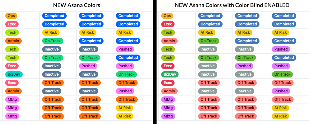
While I do NOT want this to detract from Asana actually either reverting the color palette OR (preferred) give us the ability to globally customize the color palette (which I still think this announcement distinctly implies), following is a comparison of the New Asana color palette WITHOUT and WITH the ‘Enable Color Blind Friendly’ option. You can find this setting in the upper right > Profile Icon > My Profile Settings > Display > Enable color blind friendly mode (thanks @jtown ambassador).
3 Likes
Old color please, the new color is strikingly high in saturation and distracting
4 Likes
That seems very surprising since they seemed to have focused on contrast by writing sometimes in black and sometimes in white… From experience, ability to read is really personal and there are “design rules” to make sure most people are confortable… I do not like all the new choices but guessed it was better for most people.
I might need to add details then ![]() by “hard to read” I meant that colours are very bright, and it’s hard to:
by “hard to read” I meant that colours are very bright, and it’s hard to:
- either focus on specific fields (personally, I feel that I used to clearly identify colour and text at the same time, but now the text is harder to identify given the brightness)
- or to look at colour trends on a whole project across multiple fields (Just like the last comment hereabove from @Aj_D where he compares NEW vs ColorBlind, the global trends look much better to me on the ColorBlind version)
Now I agree this is quite personal, I’m just expressing a general feeling from my teams (50+ people). And I see that many people agree here in the replies.
3 Likes
I’ll be the one person in the comments to say I actually like the change. While I would still appreciate the ability to change the background color to something darker, the bolder colors work better for me.
I think the issue isn’t ‘necessarily’ with a single background color/text color combination, it’s that the Asana team might not have considered how MANY of those colors together in the same area ends up being like SOMEONE IS TEXTING THEIR ENTIRE MESSAGE IN ALL CAPS, ALL THE TIME.
Is it easier to read the ALL CAPS? Yes, WHEN the all caps is used for emphasis. Paragraphs and paragraphs of all caps get very difficult and fatiguing to read. I think that is what’s going on with this new color palette and I actually don’t agree that this is personal opinion, no more than I think it’s personal opinion that all caps for all text is personal opinion. There are some design standards, that while not 100% uniform are wide majority best case ‘standards’ for how visual communication is presented. Maybe that’s the designer in me, but I think history would tend to support that.
In either case, the simple (idea) solution is for Asana to actually do what their post announcement stated: “New! Updated CUSTOMIZABLE color palette for better accessibility”. Asana wrote that post subject. Asana did not write “New! Updated color palette (intended) for better accessibility”, which is actually what we got.
So… why did Asana add the word “CUSTOMIZABLE” when they didn’t need to? Are we missing something? Is Asana actually working on a second part to this color palette change that IS customizable but just didn’t make it into the release? I’ve asked this question a couple of times in this thread, but have not received any answer. It makes me wonder if there is another shoe yet to drop that will help solve this contrived issue in a much more widely satisfactory way? Hmmm…
5 Likes
I think the customizable part is that you can choose colors, albeit with a limited palette. I think a mixer or even a wider array of colors would probably be welcomed by most everyone.
2 Likes
I second this!
2 Likes
Agree with everyone. Why don’t you just give everyone the old palette back and have the new palette accessible when checking the box in My Profile Settings > Display > Enable color blind friendly mode?
3 Likes